Wednesday, January 6, 2016

Elements Book

This is the first project that I did in my Design Theory Class. The goal was to take ten pictures, five of them showing the elements art, and the rest showing the principle of design. Since we were going over the basics, I figured to put it in a children type book, so that even kids can learn the basics. The book opened up on both sides, and when the picture was on the left the element of art was being talked about. If the picture was on the right, then the picture was an example of a principle of design.

Movie Poster

One of my favorite projects was the movie poster. I created a Christmas movie poster. In the poster, I am comparing the FedEx man to Santa as the premise of the movie. This was created with Photoshop which I know how to use. Most the images did come from online, but I did create the star overlay in the background.

Frye_Kaitlyn_Movie

6 Walks

For this project, I did three walks in Sioux Center and three walks in Sioux Falls. I took notes on the surroundings along with pictures. I formatted it to hang like a mobile, with the walks in Sioux Falls on the left, and the walks on Sioux Center on the right. The hardest part is getting all the pieces to face the same way, because they like to spin around.


Photomontage

One of the last projects I did this semester was a photomontage. I montage photos from the Little Rock Nine first day of school, and pictures of mine and my brothers first day of school. The is a balance of color and black and white, further comments on the segregation of the schools.
Frye_Kaitlyn_Montage

Infographic

The main group project that we did this semester was to create an infographic containing what we learned from our textbook. I helped find the key points and the definitions for the points for the infographic. We then collaborated on the design and after a weekend of drawing a blank, one of the other members came up with the design. The group then discussed the color scheme of the infographic. 

DykstraFryeMcBirnieWilgenburg

Thursday, November 12, 2015

Illustrator Triptych

For one of my projects in my design theory class, we had to create a triptych in Illustrator. This was my first time ever working in Illustrator, but I learned it fast. For the design, we chose four letters, (I chose F-R-Y-E), and then arrange them to make a pattern. Then for the color scheme, we had to make a monochromatic one, an analogous one, and a complementary color scheme.  Below are each panel for my triptych

Analogous


Monochromatic


Complementary 
Below is the final product with the each panel pasted side by side.

Monday, February 23, 2015

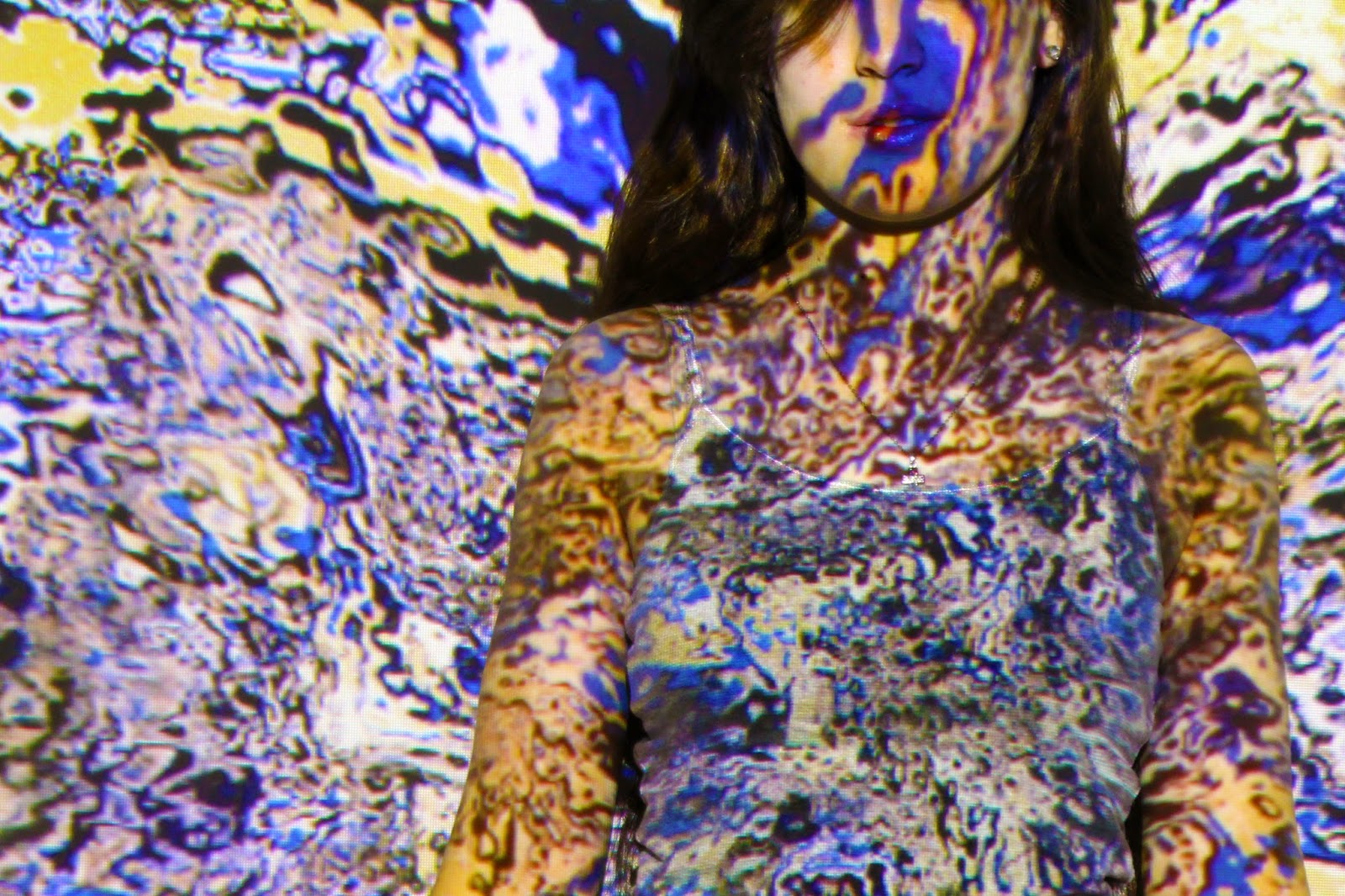
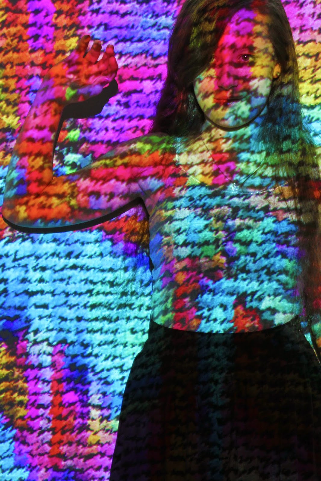
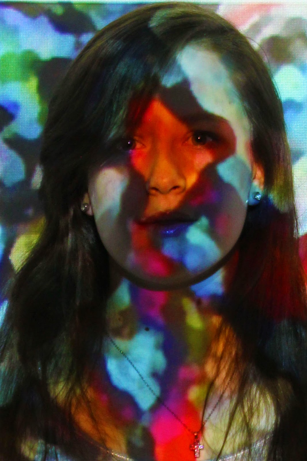
Projected Images

So my friends and I were goofing around and we were projecting images on ourselves from a projector. I soon grabbed my camera and started to take pics. These are some of the good pictures that I took with the projections. Enjoy!